I have been creating digital products for 5 years for various platforms. My portfolio includes diverse solutions for different products - from retail, ecom, and sporttech to horeca and edtech projects. Currently, I am actively involved in implementing various LLMs and creating new pipelines to improve design processes.
I have been creating digital products for 5 years for various platforms. My portfolio includes diverse solutions for different products - from retail, ecom, and sporttech to horeca and edtech projects. Currently, I am actively involved in implementing various LLMs and creating new pipelines to improve design processes.

Okko
Product context
A joint activation page for Okko — the Russian streaming service — distributed via Beltelecom, the largest internet service provider in Belarus. Beltelecom subscribers get access to Okko as part of their package. The page is the sole entry point for activating this access.
Product context
A joint activation page for Okko — the Russian streaming service — distributed via Beltelecom, the largest internet service provider in Belarus. Beltelecom subscribers get access to Okko as part of their package. The page is the sole entry point for activating this access.
My role
Full-cycle product designer. Conducted an audit of the existing page, identified drop-off points, redesigned the registration form and the success screen, and created a second version with a content layer beneath the form.
My role
Full-cycle product designer. Conducted an audit of the existing page, identified drop-off points, redesigned the registration form and the success screen, and created a second version with a content layer beneath the form.

Problem
Form without context and help
The page dropped users straight into a form for a service they might have never heard of. No explanation, no support, no reason to trust what was being asked.
Problem
Form without context and help
The page dropped users straight into a form for a service they might have never heard of. No explanation, no support, no reason to trust what was being asked.
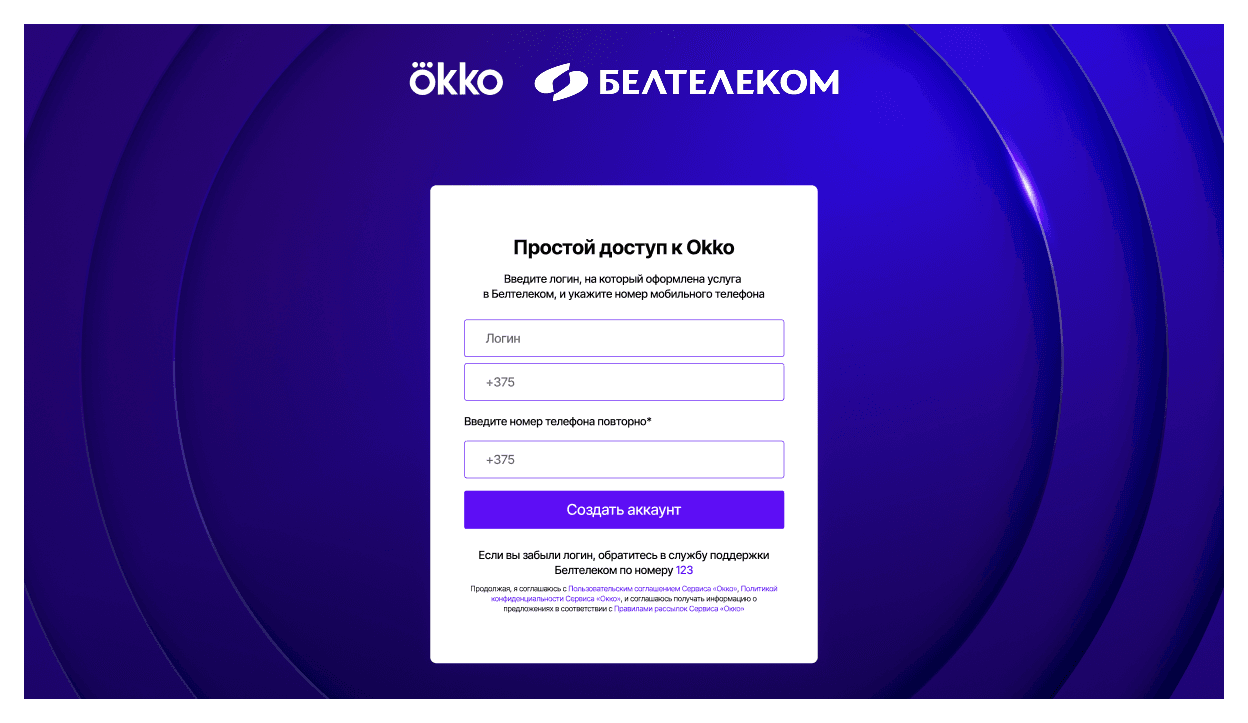
An empty page with fields and no instruction above them
There is no explanation of what a "service login" is and which phone number is required
The form did not fit in a single viewport — it was necessary to scroll
The old screen opened with two input fields and a button. Nothing explained what the "Beltelecom service login" was, where to find it, or why the phone number was needed twice. Users who got confused had no way forward other than calling support. Analytics confirmed the obvious: most left without completing the form. The page was requesting specific technical data from a non-technical audience — without any preparation.
The old screen opened with two input fields and a button. Nothing explained what the "Beltelecom service login" was, where to find it, or why the phone number was needed twice. Users who got confused had no way forward other than calling support. Analytics confirmed the obvious: most left without completing the form. The page was requesting specific technical data from a non-technical audience — without any preparation.
Solution
We explain and we tell
I redesigned the page around a single principle: context before commitment. Instructions at the top, tooltips in the fields, and a one-click video guide.
Solution
We explain and we tell
I redesigned the page around a single principle: context before commitment. Instructions at the top, tooltips in the fields, and a one-click video guide.

A brief instruction above the form explains what is needed and why
The tooltip on the login field explains the term 'service login'
Popup video guide — one click, closes, with a direct link to the Beltelecom account inside
The redesign fits into a single viewport — no scrolling is needed. The link to the Beltelecom personal account is located right in the instructions block for those who need to find their data. The video guide opens on top of the page — the user does not lose their place. Every failure point identified in the analytics received a direct response in the design.
The redesign fits into a single viewport — no scrolling is needed. The link to the Beltelecom personal account is located right in the instructions block for those who need to find their data. The video guide opens on top of the page — the user does not lose their place. Every failure point identified in the analytics received a direct response in the design.
Problem
Nothing to watch, no reason to stay
The page asked to register in a service the user might have never heard of — and nothing below the form justified this request. In Belarus, streaming is not yet a habit.
Problem
Nothing to watch, no reason to stay
The page asked to register in a service the user might have never heard of — and nothing below the form justified this request. In Belarus, streaming is not yet a habit.
No product preview
There is no explanation of what Okko contains and why it is worth activating
Users without interest had no reason to scroll or change their mind
The original page ended with a form. Users who hesitated had nowhere to go — no content, no value proposition, no second chance. For a market where streaming penetration is still growing, the page assumed intent that many users simply did not have. The bounce rate reflected this directly.
The original page ended with a form. Users who hesitated had nowhere to go — no content, no value proposition, no second chance. For a market where streaming penetration is still growing, the page assumed intent that many users simply did not have. The bounce rate reflected this directly.
Solution
Showing the product
Added a fully-fledged content layer below the form: a selection of TV series and movies, blocks highlighting the benefits, and a subscription banner — optionally everything is clickable and scrolls back to the form.
Solution
Showing the product
Added a fully-fledged content layer below the form: a selection of TV series and movies, blocks highlighting the benefits, and a subscription banner — optionally everything is clickable and scrolls back to the form.

Top TV series and movies from Okko are visible before registration
Benefit blocks: weekly premieres, exclusives, sports, TV channels, kids profile, offline
Every content element and banner scrolls the user back to the form upon click
The logic mirrors the mini-landing page. Users without immediate intent can scroll down, see what Okko actually contains, and return to the form with a reason. The content layer does not replace the form — it earns it. Show first, then ask. By the time the CTA appears again at the bottom, the decision feels conscious rather than forced.
The logic mirrors the mini-landing page. Users without immediate intent can scroll down, see what Okko actually contains, and return to the form with a reason. The content layer does not replace the form — it earns it. Show first, then ask. By the time the CTA appears again at the bottom, the decision feels conscious rather than forced.
Result
Conversion increased, bounce and drop-off rates decreased
All metrics improved after the redesign. The registration form and the content layer, working together, yielded the biggest increase.
Result
Conversion increased, bounce and drop-off rates decreased
All metrics improved after the redesign. The registration form and the content layer, working together, yielded the biggest increase.

Overall conversion: +37%
Bounce rate: 69% → 48%
Form drop-off: 40% → 32%
The conversion improvement came from two fronts simultaneously: fewer users left before interacting with the form, and more of those who started the form completed it. The reduction in the bounce rate came mainly from the content layer — users who would have left immediately now had something to look at. The reduction in form drop-off came from the instruction block and tooltips, which directly addressed the points where users were getting stuck. Three problems, three solutions, one figure that reflects them all.
The conversion improvement came from two fronts simultaneously: fewer users left before interacting with the form, and more of those who started the form completed it. The reduction in the bounce rate came mainly from the content layer — users who would have left immediately now had something to look at. The reduction in form drop-off came from the instruction block and tooltips, which directly addressed the points where users were getting stuck. Three problems, three solutions, one figure that reflects them all.