I have been creating digital products for 5 years for various platforms. My portfolio includes diverse solutions for different products - from retail, ecom, and sporttech to horeca and edtech projects. Currently, I am actively involved in implementing various LLMs and creating new pipelines to improve design processes.
I have been creating digital products for 5 years for various platforms. My portfolio includes diverse solutions for different products - from retail, ecom, and sporttech to horeca and edtech projects. Currently, I am actively involved in implementing various LLMs and creating new pipelines to improve design processes.

Kitchen garden. Tasks
Product context
An assistant app for hobby gardeners, primarily aged 40+. It features weekly task lists, articles, Q&As, and masterclasses, tailored to the specific region and growing season.
Product context
An assistant app for hobby gardeners, primarily aged 40+. It features weekly task lists, articles, Q&As, and masterclasses, tailored to the specific region and growing season.
My role
Product designer. Redesigned the registration flow as part of a wider application improvement.
My role
Product designer. Redesigned the registration flow as part of a wider application improvement.

Problem
The registration overlayed the content
The app stopped users at the entrance before they could see anything of value. For the 40+ audience, who are often unfamiliar with the product category, the first impression is everything — and that first impression was the form.
Problem
The registration overlayed the content
The app stopped users at the entrance before they could see anything of value. For the 40+ audience, who are often unfamiliar with the product category, the first impression is everything — and that first impression was the form.
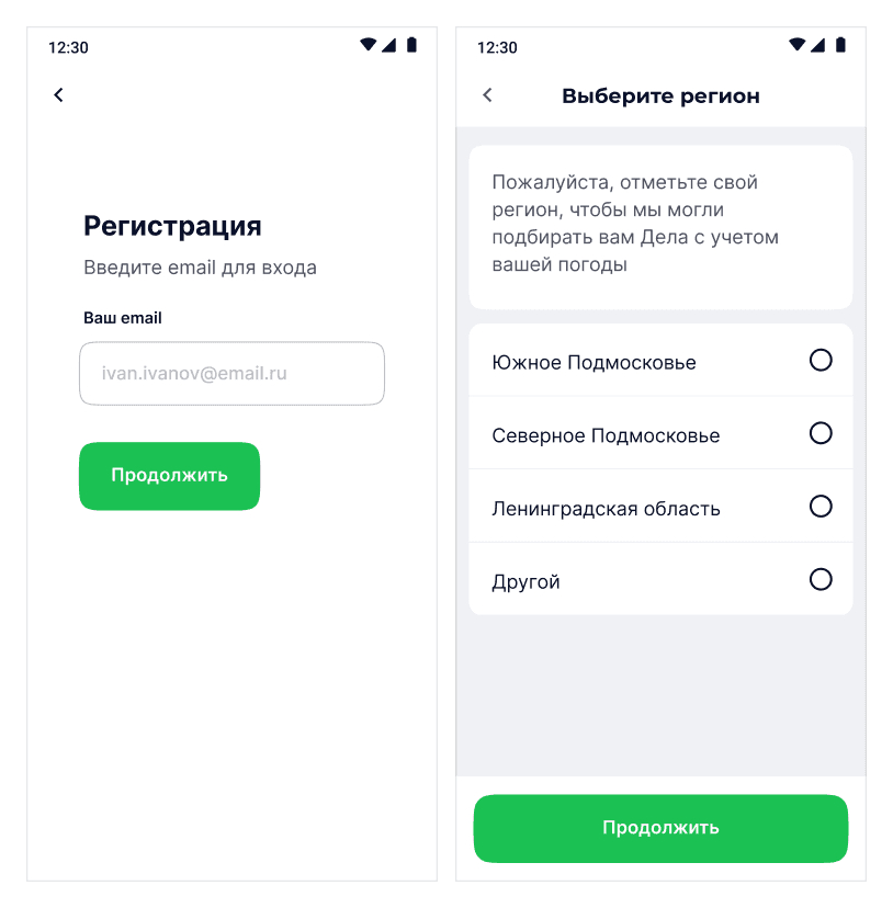
An empty screen without any context about what the application does
There is no option to explore the product before registering
The registration screen appeared at the entrance before the user had a reason to stay
The old screen was just a white page with a single email field and a continue button. No product preview, no explanation of what Ogorod Dela is, and no way out other than filling out the form or leaving. Users arriving from ads or recommendations had zero context. Analytics confirmed the obvious: most new users left without a single interaction. The ask came before value was delivered — every single time.
The old screen was just a white page with a single email field and a continue button. No product preview, no explanation of what Ogorod Dela is, and no way out other than filling out the form or leaving. Users arriving from ads or recommendations had zero context. Analytics confirmed the obvious: most new users left without a single interaction. The ask came before value was delivered — every single time.
Solution
Popup instead of a wall
Replaced the rigid barrier with a bottom sheet that slides up over the live app screen, allowing the user to see the product before making a decision.
Solution
Popup instead of a wall
Replaced the rigid barrier with a bottom sheet that slides up over the live app screen, allowing the user to see the product before making a decision.

The app's content is visible behind the shield pending any decision
Two clear actions: register or log in, nothing extra
The sheet closes — you can explore the app and register later
The bottom sheet appears on top of the actual main screen — tasks, articles, the 'Dela' hero block — so the user immediately understands the essence of the product. Closing the sheet doesn't lead to a dead end: you can scroll through the mini-landing page, see what's in each section, watch a short video — and encounter the registration prompt again at the bottom, now with full context. The point of friction has moved from the entry point deeper into the application, to where registration actually makes sense.
The bottom sheet appears on top of the actual main screen — tasks, articles, the 'Dela' hero block — so the user immediately understands the essence of the product. Closing the sheet doesn't lead to a dead end: you can scroll through the mini-landing page, see what's in each section, watch a short video — and encounter the registration prompt again at the bottom, now with full context. The point of friction has moved from the entry point deeper into the application, to where registration actually makes sense.
Result
Now we are without a block
Moving the friction point later in the flow directly impacted early retention across all tracked metrics.
Result
Now we are without a block
Moving the friction point later in the flow directly impacted early retention across all tracked metrics.

Drop-off on the registration screen: 88% → 60%
Time in the app during the first week after launch: +20%
Onboarding: did not exist before, now it does
Users who previously left without seeing the application now stay long enough to find a reason to sign up. The 28% reduction in bounces did not come from simplifying the form, cutting fields, or changing the copy. The guide launched alongside the new flow added another layer: new users began spending 20% more time in the application during their first week, indicating that orientation and onboarding together amplify the effect of a soft entry point.
Users who previously left without seeing the application now stay long enough to find a reason to sign up. The 28% reduction in bounces did not come from simplifying the form, cutting fields, or changing the copy. The guide launched alongside the new flow added another layer: new users began spending 20% more time in the application during their first week, indicating that orientation and onboarding together amplify the effect of a soft entry point.