EN

I have been creating digital products for 5 years for various platforms. My portfolio includes diverse solutions for different products - from retail, ecom, and sporttech to horeca and edtech projects. Currently, I am actively involved in implementing various LLMs and creating new pipelines to improve design processes.

EN

I have been creating digital products for 5 years for various platforms. My portfolio includes diverse solutions for different products - from retail, ecom, and sporttech to horeca and edtech projects. Currently, I am actively involved in implementing various LLMs and creating new pipelines to improve design processes.

Product context

A multiplatform streaming application for mobile, tablets, desktop, and TVs. Content by subscription: movies, TV series, and live channels.

Product context

A multiplatform streaming application for mobile, tablets, desktop, and TVs. Content by subscription: movies, TV series, and live channels.

My role

Product designer. Redesigned the entire application based on user research and analytics.

My role

Product designer. Redesigned the entire application based on user research and analytics.

Problem

Home screen

Content was lost behind the structure — the app gave no reason to watch. The old homepage opened with an advertising banner. The actual content was pushed down before the user even had a chance to get interested in it.

Problem

Home screen

Content was lost behind the structure — the app gave no reason to watch. The old homepage opened with an advertising banner. The actual content was pushed down before the user even had a chance to get interested in it.

Advertising banner on the first screen instead of content

Small posters without a visual focus — it is unclear what should catch the eye

Five items in the tab bar without grouping, the navigation competed with the content

The old home screen didn't give users an entry point. The posters were small, the text was dense, and ads came first. People would open the app to watch something — and didn't know where to start. The five-item tab bar added noise instead of helping them navigate.

The old home screen didn't give users an entry point. The posters were small, the text was dense, and ads came first. People would open the app to watch something — and didn't know where to start. The five-item tab bar added noise instead of helping them navigate.

Solution

Large hero and three-point navigation

Replaced the promotional layout with a full-screen hero banner as an entry point, and shortened the tab bar to three items.

Solution

Large hero and three-point navigation

Replaced the promotional layout with a full-screen hero banner as an entry point, and shortened the tab bar to three items.

The hero banner gives the content a visual weight it didn't have before

Categories replace section headers — navigation is faster

"Continue Watching" is visible without scrolling — the most likely next action is right on the screen

The homepage now opens with content, not ads. The recommended movie or TV series takes up the entire screen, allowing the user to immediately understand what to watch. The tab bar has been reduced from five items to three: home, live, and favourites. Advertising has not disappeared — it has simply stopped being the first thing the user sees.

The homepage now opens with content, not ads. The recommended movie or TV series takes up the entire screen, allowing the user to immediately understand what to watch. The tab bar has been reduced from five items to three: home, live, and favourites. Advertising has not disappeared — it has simply stopped being the first thing the user sees.

Problem

TV series page

The information was dumped without any anchor points — it was unclear what to do next The old page looked like a questionnaire: data was stacked from top to bottom, there were two competing ratings, and the Watch button was completely missing.

Problem

TV series page

The information was dumped without any anchor points — it was unclear what to do next The old page looked like a questionnaire: data was stacked from top to bottom, there were two competing ratings, and the Watch button was completely missing.

Two ratings side-by-side without logic — Kinopoisk and IMDb argued with each other

There is no permanent Watch button — you had to search for how to start watching

The season and episode selection was placed too far down — you had to scroll to reach it

The page did not answer the user's main question: how to start watching. There was no Watch button at all — this most common action on a TV show page was simply missing. The two ratings side-by-side created confusion. The episode selector was lost at the bottom of the page.

The page did not answer the user's main question: how to start watching. There was no Watch button at all — this most common action on a TV show page was simply missing. The two ratings side-by-side created confusion. The episode selector was lost at the bottom of the page.

Solution

Hero banner as an anchor and a persistent Watch button at the bottom of the screen

Replaced the layout form with a full-screen hero banner, added a permanent Watch CTA, and moved the episode selection to a fixed position.

Solution

Hero banner as an anchor and a persistent Watch button at the bottom of the screen

Replaced the layout form with a full-screen hero banner, added a permanent Watch CTA, and moved the episode selection to a fixed position.

One unified rating instead of two competing ones

The persistent Watch button is always visible — added for the first time

The choice of season and episode is fixed at the bottom of the screen — no scrolling is needed
The hero banner provides the page with a visual anchor: the title, description, rating, and age rating are all in place, but in a more compact and deliberate layout. The partner label shows which service owns the title. The Watch CTA is permanent — the user always knows where they are and what to do next.

The hero banner provides the page with a visual anchor: the title, description, rating, and age rating are all in place, but in a more compact and deliberate layout. The partner label shows which service owns the title. The Watch CTA is permanent — the user always knows where they are and what to do next.

Problem

Settings

Pop-ups instead of pages — an unpredictable and inconsistent interface Some options opened in pop-ups, while others led to separate screens. The user did not know what to expect.

Problem

Settings

Pop-ups instead of pages — an unpredictable and inconsistent interface Some options opened in pop-ups, while others led to separate screens. The user did not know what to expect.

Choosing options via popups is inconsistent and inconvenient on mobile

The log out option was missing from the settings screen

The help section was not accessible from settings

The settings lacked any predictable logic. One tap would open a popup, while another led to a new screen — with no apparent reason. Two crucial elements were missing entirely: there was nowhere to log out or find help. For an audience that isn't always confident with digital interfaces, this represents a real barrier.

The settings lacked any predictable logic. One tap would open a popup, while another led to a new screen — with no apparent reason. Two crucial elements were missing entirely: there was nowhere to log out or find help. For an audience that isn't always confident with digital interfaces, this represents a real barrier.

Solution

Nested pages everywhere and two missing elements added

Replaced the popups with a single nested page pattern, added sign-out, and a help section.

Solution

Nested pages everywhere and two missing elements added

Replaced the popups with a single nested page pattern, added sign-out, and a help section.

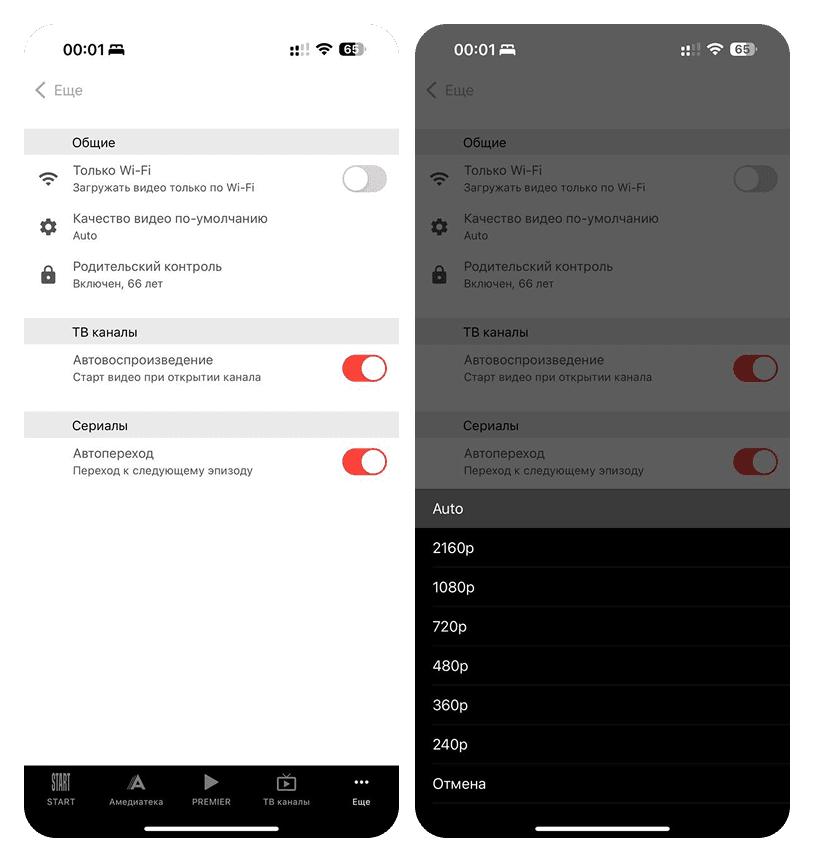
Pop-ups have been replaced with sequential nested pages everywhere

The settings are grouped into sections: general, TV channels, TV shows, help, other

Log out option and help section have been added — they were previously missing

The user now always knows what to expect: any tap leads to a new screen, with no accidental pop-ups. Quick toggles remain toggles — the rest follows a single pattern. A minimal shift in UX, but a significant cleanup in the UI.

The user now always knows what to expect: any tap leads to a new screen, with no accidental pop-ups. Quick toggles remain toggles — the rest follows a single pattern. A minimal shift in UX, but a significant cleanup in the UI.

Result

Faster to find, easier to start, fewer lost users

All three metrics improved — each reflecting a separate issue that the redesign resolved.

Result

Faster to find, easier to start, fewer lost users

All three metrics improved — each reflecting a separate issue that the redesign resolved.

Time to find a specific TV series: 47 → 33 sec

Found a subscription plan in one minute: 50% → 90%

Time from app launch to playback: 28 → 8 sec

The search has become faster thanks to the hero banner and category chips – content is now visible straight away. Nine out of ten users now find the subscription – previously, half of them couldn't find it at all. The path to playback has been cut threefold: the constant Watch button and fixed episode selection have removed unnecessary steps. Every figure points to one thing: when the interface gets out of the way, users move faster.

The search has become faster thanks to the hero banner and category chips – content is now visible straight away. Nine out of ten users now find the subscription – previously, half of them couldn't find it at all. The path to playback has been cut threefold: the constant Watch button and fixed episode selection have removed unnecessary steps. Every figure points to one thing: when the interface gets out of the way, users move faster.

Create a free website with Framer, the website builder loved by startups, designers and agencies.